“Our fuel is low. Are we going to make it?”
Lt. Mitchell, the pilot of Boeing B-17E, kept pulling hard on the stick, taking his Flying Fortress with its 8-men crew, into a climb, at the angle that was much steeper than what was recommended, even for a bomber with “empty belly”. The aircraft lost a lot of fuel while doing a round circle to the target, while fighting winds and severe turbulence. Although the weather conditions on the way back home were much milder, the fuel tanks, peered with bullet holes, were leaking and it was bitterly ironic for Lt. Mitchell that after successfully completing the mission, without losing a single crewmen, he would have to crash-land his plane into the Pacific Ocean, such short distance from a home base. The pilot’s decision was to use the remaining fuel to climb as high as possible and then take his chances of losing fuel at high altitude, by gliding towards the mainland.
- “How are we doing on fuel?” – screamed Lt. Mitchell to his navigator Lt. Johnson.
- “We are about two notches from red” – the navigator replied.
Once receiving the answer from his navigator Lt. Johnson, the pilot immediately knew that he had only about 440 liters of fuel left (of the overall internal fuel capacity of B-17E). The pilot made this determination based on two basic facts: he knew what each ‘notch’ meant on his fuel dial, in terms of liters, and he knew that ‘red’ represented a specific zone on fuel dial, when an aircraft was in high danger of crashing, based on real life statistics and engineering calculations. In fact, for an experienced pilot like Mitchell, the exact “liters remaining” or “about two notches from red” were equally informative statements – they both helped him visualize how many more miles his plane could stay in air with the engines running. The pilot knew well his plane’s instruments panel and could quickly visualize the arrow of a fuel gadget, respectively to “0”, with or without color coding. But even a very experienced pilot would need to know an average liter per kilometer rate of fuel consumption, in order to derive how long he can keep his plane in the air.
During WWII, when sophisticated simulation equipment was not available, it would be up to a skilled crew (pilot, navigator) to manually calculate their chances of safe landing: calculations were done based on raw numbers available on a navigation panel and on flying conditions. Back then, it was always up to a human to determine “when does amber become red?” and how weather conditions factor in. Truth to be told: depending on wind direction (headwind vs. tailwind, turbulence, plane weight), the actual point of crossing from amber going into red, could shift against or in favor of the odds of a crew to flight to safety.

The arrows above should read as follows:
- Arrow point to Left: “Headwind”
- Arrow pointing to Right: “Tailwind”
Note: Numerical values above are selected arbitrarily, for explanatory purposes only, and do not reflect technical specifications of B-17E
While, modern simulation tools can do this automatically, by factoring in multiple influencing factors, back in the 40’s it was up to skilled crewmen to manually calculate their odds. And it had to be done super-fast.
Fast forwarding to modern times….(also, cross-posted on PMI.org)
Although the RAG system (Red-Amber-Green) is still widely used in conventional project management as the method of rating issues or reporting on status, it is not only inaccurate, it is also counterproductive. There are agile reporting practices that are much more reliable.
Let’s take a look at typical definitions of RAGs that are used to rate projects:
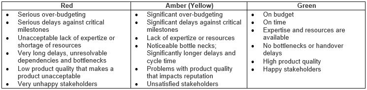
Rarely do we see projects, where the categories above are meaningfully parametrized, by using numbers. But even in situations when they are, numerical values representing each category are not comparable, so the problem of accuracy still remains.
Lack of Accuracy and Reliability
One of the key issues with RAG project status reporting is that they represent a point-in-time situation. Frequently collected from different functional groups–such as business analysis, design, architecture, development and testing–statuses get collated and someone (usually the first-level project manager) assigns them a color grading.
Between the time initial data is collected and the time RAG reporting is produced, there is usually lag time of at least a couple of days, sometimes weeks. This means that by the first time RAG reporting is presented at a project status meeting, it is already outdated. By the time status reports get produced across multiple projects and combined for senior-level status reporting, more time lapses and this makes reporting even more stale.
Another issue with RAG reporting is that usually, even at the lowest point of collation (first-level project management), there is a degree of variability that is being introduced into the system. First-level project managers do not always have enough depth and breadth of subject matter expertise to allow them to objectively “collate” reports from multiple functional areas into one all-inclusive RAG report.
Very rarely do we see a number-to-color schema that allows for subjective conversion. Although there are many technology teams that use more objective engineering indicators to report on project development health (e.g., SONAR) to monitor code quality (test coverage, duplicate lines of code, broken rulesets, number/priority of bugs, etc.), when this information is combined with less objective indicators (e.g. BRD or Business Requirement Document, level of completion, number of change requests created, fast approaching deadlines), the overall result is less than objective. We have an effect of adding “apples to oranges,” when non-comparable data sets are added up and are further combined and then translated into colors.
What presents even more ambiguity are the threshold points, where green becomes amber and amber becomes red. Since there is no a reliable numerical scale that is based on scientific evidence and historical data, decisions about project color changing are purely arbitrary, subjective and guessed.
Frequently, we hear questions coming from senior management and cascaded down to teams: “Can we identify path to green?” or “What would it take us to go back to green again?” Effectively, senior management is asking what it would take to put a project back on track. And the same challenge presents itself again, as with escalation: while potential improvement steps can be identified, it is practically impossible to quantify what it would take, for example, to downgrade the project from amber back to green. Decisions are still very subjective.
Blame Passing and “Contract Gaming”
What is the underlying cause of, and problem with, conventional RAG status reporting? And what can it lead to? RAGs are caused by internal contractual plans (not to be confused with legal contracts that define relationships with external vendors or third parties), where different functional areas of the same organization hold themselves contractually accountable for “all or none” commitments.
In situations like these, a classic project management triangle is mistakenly fixed at all three angles (time, scope and cost). In their lightweight Large-Scale Scrum (LeSS) framework, Craig Larman and Bas Vodde discuss problems associated with “The Contract Game” (which starts about the 34th minute on the YouTube video) by revealing that convoluted schema of bonus distributions and promotions leads to system gaming and subjective RAG status reporting.
Effectively, feared workers and pressured first-level managers hesitate to announce to more senior managers and executive leadership that project is no longer green. Why? Because individual compensations and promotions are at stake. Naturally, as status reports “roll up” they typically get “fudged” and become less inflaming. By the time top executives get summary reports across multiple projects, programs and portfolios, information is not only outdated but also much rosier than when it came from a source.
It is worth noting that constant fear of reprisals and other adverse consequences caused by yellows and reds also lead to bad, unethical behaviors such as finger pointing and blame shifting. Different functional areas that are involved in internal “contract” negotiation and handovers tend to demand “more, more, more” from their respective “obligors” and provide “less, less, less” to their respective “obligees.”
As everyone who is involved in a convoluted RAG reporting schema has something to lose in case a project shifts away from green, information gets sanitized and subjectively “improved” at every escalation level. It is not uncommon to see a few amber and a few green statuses meet at a higher level and the outcome being unjustifiably green.
At every level, attempts are being made to keep status reporting within “green boundaries” or as close to green as possible. This goes on until some short time before the last possible deadline, when a customer no longer wishes to wait and demands a product. This is when we observe an embarrassingly abrupt color change: green, green, green, green, red (sometimes even skipping amber). It is at this point when all parties start making monumental efforts to return a project back on track (back to green). Usually this is done without the customer, but it is not uncommon that an internal customer is a part of the conspiracy. Why? Because their bonuses and promotions are also at stake.
It is here where a project management iron triangle starts to experience unbearable tension at all three corners. But since all three corners are locked, it is usually Q (quality) that gives way. Larman refers to this phenomena as “Secret Toolbox”: spaghetti code, lack of testing, numerous bugs, etc.
Conclusion
It is clear that the ways RAG statuses are being used today by most project managers are unreliable and misleading. This claim is based on the following:
- Project managers don’t truly control project progress, and their project progress indicators do not have an objective numerical scale. Reporting is subjective and immaterial.
- Project managers are under constant pressure and scrutiny of more senior managers that are positioned even further away from action. This pressure is passed on to individuals and teams that preform work and invent reporting data containing flaws.
Today, RAG status reporting is analogous to “Chinese telephone,” which is also accompanied by an element of fear of reprisal from above and unhealthy motivation to present things better than they are as they roll from the bottom to the top.
Other Options
Below are some simple alternatives for how to handle issues associated with RAGs:
1. Complete abandonment of RAGs: Abandon RAGs altogether. Lack of reliability, bad behaviors and the systemic harm that they cause in the majority of cases is apparent. Why continue causing a self-inflicted wound?
Even when produced without fudging and data-alteration, RAG reports are still subjective and provide a false sense of comfort. Why not put a stop to what has outlived itself? Instead of reporting on “point in time” colors, teams and managers at all levels should educate themselves and start using more incremental/gradual status reporting tools.
Such tools are frequently used by product development teams that use agile frameworks. Instead of communicating point-in-time outdated statuses, agile teams/projects are able to seamlessly produce reports that are based on reliable, empirical and up-to-date data. Such reports include (but are not limited to): sprint or release burn-up or burn-down charts, cumulative flow diagrams (CFD), epic burn-up or burn-down charts and other agile metrics.
What is left is to collate and meaningfully roll up relevant data across multiple streams of work. This can be seamlessly done by using various scaling techniques and a variety of dynamic agile tools. This approach also removes the need for subjective interpretation and escalation of data equally and fairly across all organizational levels. It also minimizes manual labor, and therefore reduces systemic waste.
2. Tight coupling of color coding with numerical data: But what if at certain high organizational levels, senior management does not have time to review raw metrics and interpret data from multiple sources? What if, indeed, at certain levels of organization structure, reporting of “We are green” versus “We are amber” is still preferred?
If RAG reporting is absolutely inevitable, organizations need to introduce an intuitive and objective numerical scale that represents each color, emphasizing its upper and lower boundaries. This should not be done subjectively by hands-off people, but rather by individuals that intimately understand the true impact of a particular measurable parameter.
Note: This post has been created to aid you in reading another post about RAGs, the initial paragraph of which can be found here: https://www.keystepstosuccess.com/2016/01/fallacies-of-rag-reports/